Imagine stepping into a place where movement is medicine, strength is rediscovered, and calm is carefully restored.
This isn’t just a physiotherapy clinic. It’s a human reset studio. Pneuma Havens is a health and wellness company specializing in physiotherapy, wellness, and fitness services.
We worked with the stakeholders on an immersive brand experience that carries the brand messaging and DNA of this unicorn
This project is a perfect blend of mindfulness, balance, and elegance, crafted to represent a brand dedicated to holistic well-being and inner peace.
A holistic identity
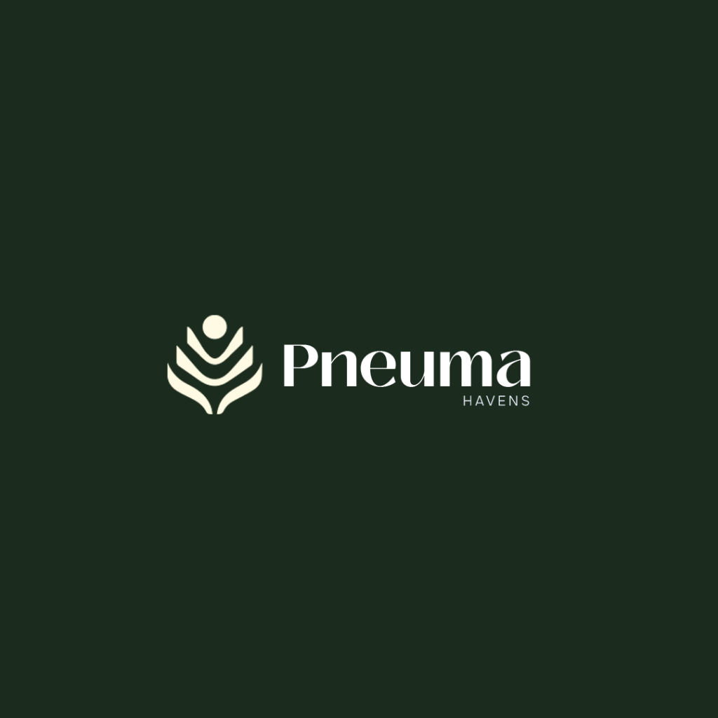
The brand mark focuses on the 3 major arms of Pneuma havens – Physical Therapy, Fitness and wellness and relaxation.
The Mark features Caring hands (Clinical arm) + Human + Zen stones in an all-man-eat show to create a unique premium and scalable identity
A distinctive logo that stands out in the Physiotherapy and wellness industry.
The Pneuma Havens logo symbolizes tranquility and flow, merging soft, organic shapes with minimalist typography. The calming, nature-inspired color palette reflects the harmony of yoga, meditation, and wellness. This timeless design evokes a sense of stillness and connection, perfect for a brand built for a premium audience
This mark is a visual that evoke peace, balance, and mindfulness, forming a deep connection with the audience.
This brand does not sit in a single room. It moves, It stretches.
It breathes.
It adapts.
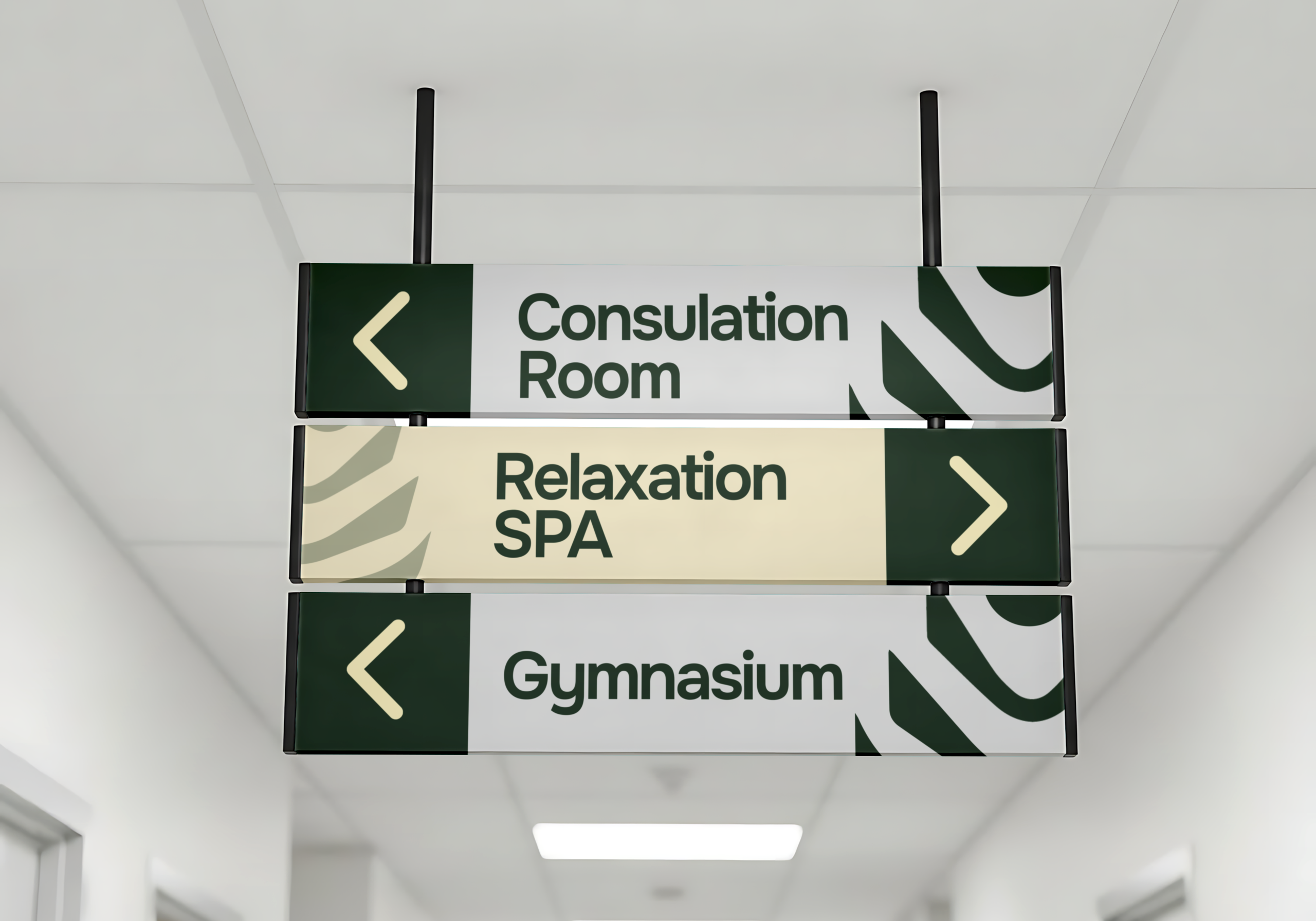
Its identity is not a rigid logo stamped on walls — it is a rhythm that flows into everyday people and things
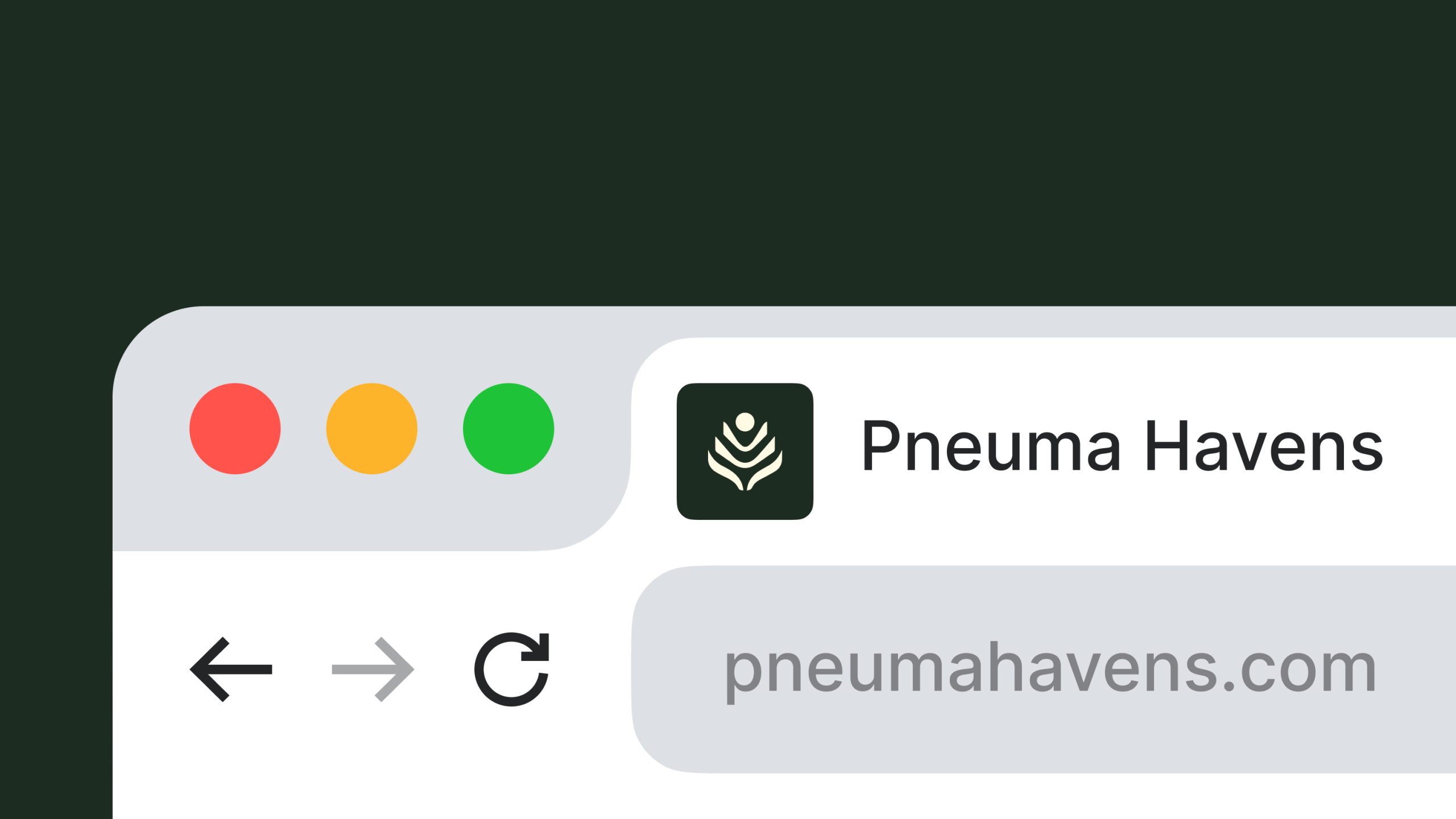
A cohesive brand identity designed to work seamlessly across digital platforms, wellness products, event signage, and more.
We use cookies on our website to give you the most relevant experience by remembering your preferences and repeat visits. By clicking “Accept All”, you consent to the use of ALL the cookies. However, you may visit "Cookie Settings" to provide a controlled consent.
This website uses cookies to improve your experience while you navigate through the website. Out of these, the cookies that are categorized as necessary are stored on your browser as they are essential for the working of basic functionalities of the website. We also use third-party cookies that help us analyze and understand how you use this website. These cookies will be stored in your browser only with your consent. You also have the option to opt-out of these cookies. But opting out of some of these cookies may affect your browsing experience.
Necessary cookies are absolutely essential for the website to function properly. These cookies ensure basic functionalities and security features of the website, anonymously.
Cookie
Duration
Description
cookielawinfo-checkbox-analytics
11 months
This cookie is set by GDPR Cookie Consent plugin. The cookie is used to store the user consent for the cookies in the category "Analytics".
cookielawinfo-checkbox-functional
11 months
The cookie is set by GDPR cookie consent to record the user consent for the cookies in the category "Functional".
cookielawinfo-checkbox-necessary
11 months
This cookie is set by GDPR Cookie Consent plugin. The cookies is used to store the user consent for the cookies in the category "Necessary".
cookielawinfo-checkbox-others
11 months
This cookie is set by GDPR Cookie Consent plugin. The cookie is used to store the user consent for the cookies in the category "Other.
cookielawinfo-checkbox-performance
11 months
This cookie is set by GDPR Cookie Consent plugin. The cookie is used to store the user consent for the cookies in the category "Performance".
viewed_cookie_policy
11 months
The cookie is set by the GDPR Cookie Consent plugin and is used to store whether or not user has consented to the use of cookies. It does not store any personal data.
Functional cookies help to perform certain functionalities like sharing the content of the website on social media platforms, collect feedbacks, and other third-party features.
Performance cookies are used to understand and analyze the key performance indexes of the website which helps in delivering a better user experience for the visitors.
Analytical cookies are used to understand how visitors interact with the website. These cookies help provide information on metrics the number of visitors, bounce rate, traffic source, etc.
Advertisement cookies are used to provide visitors with relevant ads and marketing campaigns. These cookies track visitors across websites and collect information to provide customized ads.